02.07.18
Craft, independent and micro brewers are using creative packaging on both cans and bottles as a way for their products to stand out on the shelves. Even when the cans are available only at the source, a label, or design printed directly to the substrate, helps provide an identity – an instantly recognizable image and brand.
“Without ink, every can would look the same: aluminum,” Coronado Brewing Company’s creative coordinator Dan Pressler says.
Unlike other packaging, cans are formed from a coil of aluminum, and the design is printed on the can all while on the high-speed production line.
“By printing directly on the can with standard inks, or by using Ball’s specialty inks or finishes, brewers can position their beverage as a premium product in a premium package,” said Megan Easterling, marketing manager for Ball’s North & Central American metal beverage packaging business. “Also, not having to post-label the cans removes added costs, time and complexity leaving more time to brew great beer.”
Over the years, CBC has implemented changes in its packaging:
Pressler provided reasons why his company employs both screen printing along with wraps – as well as the advantages and disadvantages.
“Substrate cans provide a cost-effective solution to your canning business. However, you’ll need space to store the minimum order of cans in your warehouse,” said Pressler, who joined CBC in 2010. “If you know you’re not going to change the artwork of your can and have the space, then substrate is a great solution for your business.
“Wrapped cans provide fast, flexible solutions for can packaging,” he continued. “You have a smaller minimum order with a variety of print options. If you’re short on space, have smaller runs in mind, or are constantly releasing cans with different artwork, then I would suggest wrapped cans over substrate.
“Direct-print is a huge commitment for smaller to mid-sized breweries,” Pressler said. “You have to have the volume and storage for a direct-print order of cans. Whereas can wraps give us the opportunity to not only print smaller quantities, but the digital print technology of our can wraps allows us to print the entire gamut of colors and fuss with their transparencies.”
Pressler recommends referring to the Pantone color guide book and request samples before committing to an order.
“Inks and finishes help brands communicate in new and creative ways. The can provides a 360-degree billboard right in the consumers’ hand,” Easterling said. “Graphics, by way of inks, are a brewer’s chance to communicate with their customers, fostering brand loyalty with every can a customer picks up.”
CBC'S design process usually begins with the style and name of the beer, according to the creative coordinator.
“Once we have an idea of what we are trying to express, we can then begin playing around with different ideas,” he said. “You have to begin by asking: What are we trying to convey and how can we do this visually in the given space – a very small space?”
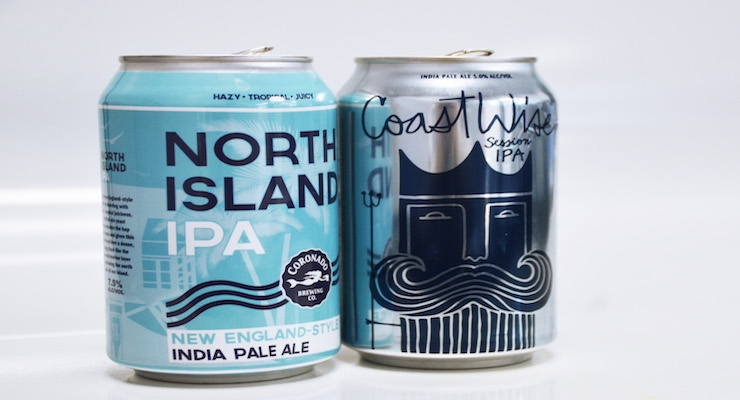
Pressler cited the 2018 can release of North Island New England-style IPA as a “great” example of this.
“The name of the beer comes from Coronado—our hometown,” he said. “Knowing this, we incorporated our iconic beach scene directly onto the can.”
After finding inspiration, he suggests not overthinking things.
“Start playing with the different elements: fonts, colors, art, patterns, and save the layout for last,” Pressler said. “After you feel good about your first attempt, throw it in the die-line and add the mandated requirements. Try not to get too frustrated here as some of these things can impede on your art.
“After you’re done with the first attempt, start working on attempts 2, 3, 4, 5…,” the California State University-Dominguez Hills graduate continued, offering more tips.
“Each design evolves and allows you to explore layout options using elements from your other attempts,” he said. “I see this as designing several small cans to complete the final overall can. [After feeling] great about your work, create digital mockups for your presentation and get ready for any revisions. Once the designs are approved, you’re ready to send them to print.”
Pressler’s all-time favorite can design is the Guiness Toucan.
“The whole campaign is classic and simple,” he said. “Toucans delivering beers from Dublin? Incredible.”
While CBC has put out hundreds of beers, the design the creative coordinator is most impressed with is for one that hasn’t hit the shelves yet: Coco Chaos Coconut IPA, which drops Feb. 24.
“The project goes beyond the digital artboard and brings the beauty of painted work into the design by using a local Coronado artist, Kelcey Fisher, (who goes by the alias KFiSH).”
Pressler and Fisher both grew up together in Coronado and wanted to collaborate on a design.
“By incorporating his unique pattern work, which can be seen on large murals throughout Los Angeles, N.Y., and San Diego, we scaled it down to fit in the palm of your hand,” Pressler said. “The whole project is exactly what beer was made to do: bring friends together.”
What sets CBC’s cans apart from others on liquor store shelves?
“Our recent Knoxville Series and Art Series beers allow us to be creative and fun in our designs. The branding here lets us use a variety of interesting colors and concepts while maintaining a coastal vibe,” Pressler said. “We try to employ design that not only intrigues a consumer, but tells a story about the beer and our brand.
“Our next Knoxville Series beer, Peach Cruiser IPA, will communicate its layers of wonderfully fun, delectable peach flavor through a soft color palette of wavy lines and 80s era font choice,” he continued. “We want individuals to look at these beers and say, ’This feels like a beer for me.’”
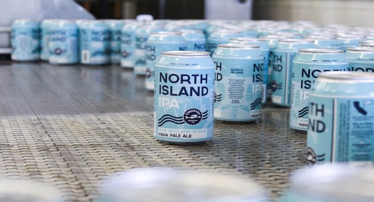
Second photo courtesy Coronado Brewing Company/Twitter
“Without ink, every can would look the same: aluminum,” Coronado Brewing Company’s creative coordinator Dan Pressler says.
Unlike other packaging, cans are formed from a coil of aluminum, and the design is printed on the can all while on the high-speed production line.
“By printing directly on the can with standard inks, or by using Ball’s specialty inks or finishes, brewers can position their beverage as a premium product in a premium package,” said Megan Easterling, marketing manager for Ball’s North & Central American metal beverage packaging business. “Also, not having to post-label the cans removes added costs, time and complexity leaving more time to brew great beer.”
Over the years, CBC has implemented changes in its packaging:
- 2010 - 2012: Original design on paper labels on glass bottles;
- 2012 - 2013: Screen printed bottles with an updated logo (oval);
- 2013 - 2014: Screen printed bottles with an updated logo (circle);
- 2014 - Present: Screen printed bottles and cans (Ball) with an updated logo (current logo);
- 2016 - Present: Supplementary digitally printed can wraps (RB Dwyer)
Pressler provided reasons why his company employs both screen printing along with wraps – as well as the advantages and disadvantages.
“Substrate cans provide a cost-effective solution to your canning business. However, you’ll need space to store the minimum order of cans in your warehouse,” said Pressler, who joined CBC in 2010. “If you know you’re not going to change the artwork of your can and have the space, then substrate is a great solution for your business.
“Wrapped cans provide fast, flexible solutions for can packaging,” he continued. “You have a smaller minimum order with a variety of print options. If you’re short on space, have smaller runs in mind, or are constantly releasing cans with different artwork, then I would suggest wrapped cans over substrate.
“Direct-print is a huge commitment for smaller to mid-sized breweries,” Pressler said. “You have to have the volume and storage for a direct-print order of cans. Whereas can wraps give us the opportunity to not only print smaller quantities, but the digital print technology of our can wraps allows us to print the entire gamut of colors and fuss with their transparencies.”
Pressler recommends referring to the Pantone color guide book and request samples before committing to an order.
“Inks and finishes help brands communicate in new and creative ways. The can provides a 360-degree billboard right in the consumers’ hand,” Easterling said. “Graphics, by way of inks, are a brewer’s chance to communicate with their customers, fostering brand loyalty with every can a customer picks up.”
CBC'S design process usually begins with the style and name of the beer, according to the creative coordinator.
“Once we have an idea of what we are trying to express, we can then begin playing around with different ideas,” he said. “You have to begin by asking: What are we trying to convey and how can we do this visually in the given space – a very small space?”
Pressler cited the 2018 can release of North Island New England-style IPA as a “great” example of this.
“The name of the beer comes from Coronado—our hometown,” he said. “Knowing this, we incorporated our iconic beach scene directly onto the can.”
After finding inspiration, he suggests not overthinking things.
“Start playing with the different elements: fonts, colors, art, patterns, and save the layout for last,” Pressler said. “After you feel good about your first attempt, throw it in the die-line and add the mandated requirements. Try not to get too frustrated here as some of these things can impede on your art.
“After you’re done with the first attempt, start working on attempts 2, 3, 4, 5…,” the California State University-Dominguez Hills graduate continued, offering more tips.
“Each design evolves and allows you to explore layout options using elements from your other attempts,” he said. “I see this as designing several small cans to complete the final overall can. [After feeling] great about your work, create digital mockups for your presentation and get ready for any revisions. Once the designs are approved, you’re ready to send them to print.”
Pressler’s all-time favorite can design is the Guiness Toucan.
“The whole campaign is classic and simple,” he said. “Toucans delivering beers from Dublin? Incredible.”
While CBC has put out hundreds of beers, the design the creative coordinator is most impressed with is for one that hasn’t hit the shelves yet: Coco Chaos Coconut IPA, which drops Feb. 24.
“The project goes beyond the digital artboard and brings the beauty of painted work into the design by using a local Coronado artist, Kelcey Fisher, (who goes by the alias KFiSH).”
Pressler and Fisher both grew up together in Coronado and wanted to collaborate on a design.
“By incorporating his unique pattern work, which can be seen on large murals throughout Los Angeles, N.Y., and San Diego, we scaled it down to fit in the palm of your hand,” Pressler said. “The whole project is exactly what beer was made to do: bring friends together.”
What sets CBC’s cans apart from others on liquor store shelves?
“Our recent Knoxville Series and Art Series beers allow us to be creative and fun in our designs. The branding here lets us use a variety of interesting colors and concepts while maintaining a coastal vibe,” Pressler said. “We try to employ design that not only intrigues a consumer, but tells a story about the beer and our brand.
“Our next Knoxville Series beer, Peach Cruiser IPA, will communicate its layers of wonderfully fun, delectable peach flavor through a soft color palette of wavy lines and 80s era font choice,” he continued. “We want individuals to look at these beers and say, ’This feels like a beer for me.’”
Second photo courtesy Coronado Brewing Company/Twitter